Welcome to 2015! The Doctor’s Tablet is entering its fourth year. When we started the blog in 2012, we had no idea what an exciting, challenging and rewarding experience it would become. Now, as we approach the 300 blog-post mark, we have an engaged audience and our content has been shared on KevinMD.com, AAMC’s Wing of Zock, the Huffington Post and, more recently, MedPageToday.
To jump-start the new year on our blog, we’ve made some changes in design and functionality to help you get the most from our content.
Surveys we’ve conducted show that the blog’s audience is 25 percent doctors and researchers, 25 percent medical students and 50 percent informed lay members of the public interested in medicine, healthcare, science, ethics and wellness. Our content matches that mix.
The Benefits and Challenges of a Diverse Audience
Our diverse content and diverse audience both present opportunities and pose challenges. Our previous design didn’t always help readers quickly find areas that might interest them. Depending on which date you visited our blog, you might have had a completely different impression of its focus. One day we’d run a detailed biomedical research piece, while another day we’d focus on a community-based activity of our medical students.
Where’s the Content I Want?
To help you find more quickly the content that interests you most, we’ve added three main tabs in blue at the top of the blog: research, education and health. These are the central missions of Albert Einstein College of Medicine.
![]() By clicking on any of these tabs, you’ll see blog posts only in those categories and find suggested similar posts.
By clicking on any of these tabs, you’ll see blog posts only in those categories and find suggested similar posts.
You’ll also have a quick, visual way to click to the corresponding area of Einstein’s website to find similar content. And on the Einstein website’s main landing pages, you’ll find an easy way to click through to our blog content.

You’ll be able easily to sample a variety of content from Montefiore Medical Center, the University Hospital for Einstein, by clicking on the Montefiore icon on the right-hand side of most pages.

Responding to You and Your Device
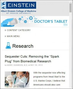
Finally, the blog will be fully responsive in design. That will allow you to optimize your experience depending on the size and type of device you’re on. If you’re using a smartphone, you’ll see more collapsed categories for quicker navigation. (See “content category” and “main menu” under the Doctor’s Tablet banner.)

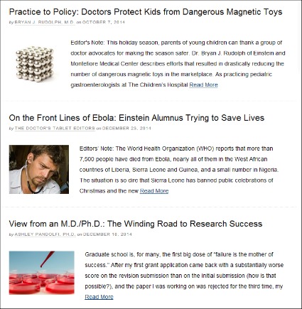
You will still, of course, have the opportunity to use the default home feed if you appreciate the diversity of our content. We’ve added more photos and made the displayed text for each post shorter so it’s easier to scroll.

These design changes won’t change your world—but we do hope they’ll save you time and help you find our content more accessible and enjoyable.
We sincerely appreciate your reading The Doctor’s Tablet and sharing your views, publicly in comments or through other social media platforms.
If you have suggestions on how we can improve, please let us know: socialmedia@einstein.yu.edu.
Here’s to a healthy, happy and easier-to-navigate 2015!

